On my own portfolio, I use a nice JS plugin to generate an animated background. My clients often ask me how I did that and to be honest, I simply used Particles.js. In this tutorial, I will show you how you can add this effect to your website too.
Check the demo to see exactly how the background is animated thanks to this plugin :
As you can see, it generates some abstract animated shapes in the background. On top of this demo, you can also this plugin in action in the header of my portfolio.
Now that you have discovered how it looks in action, I will show you how to replicate this effect on your website.
Importing Particles.JS
First of all, download the sources of Particles.JS on its author’s GitHub.
To make it work, you will need to import two files in your pages :
- The Javascript file of the actual plugin
- A JSON file that will be read by the JS plugin to generate the background shapes
For the JSON file, you can use the one of the demo folder of the ZIP you downloaded (which is the one I use in the demo) OR you can also generate your own JSON file with your custom shapes by creating it on the developer’s website.
Upload the JS and the JSON files to your website and import the JS one :
<script src="js/particles.min.js"></script>In this tutorial, you don’t need jQuery to make it work 😉
That’s it for the imports for now. Let’s add some HTML and CSS now.
The HTML and CSS for the background
For the HTML, it’s pretty simple. You only need to write one div container with an ID :
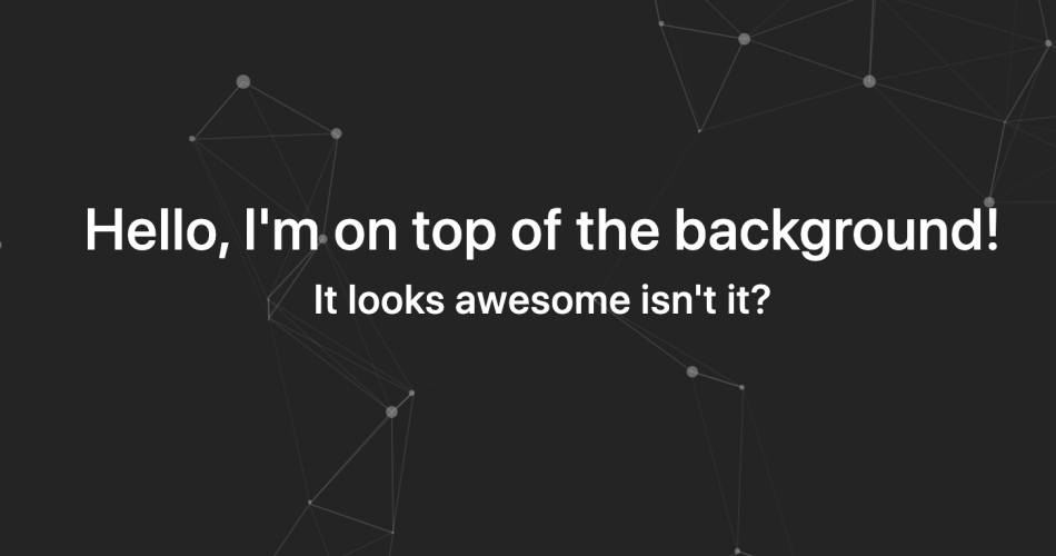
<div id="particles-js"></div>In my case I placed it just below the <body> tag. I recommend you to also place a container div below, which will act as the main content container of your website, while the #particles-js div will only be used for the background. So in my demo, the main HTML code looks like this :
<div id="particles-js"></div>

<div class="container">
    <h1>Hello, I'm on top of the background!</h1>
    <h3>It looks awesome isn't it?</h3>
</div>
Now, we will add a few lines of CSS just to make our .container div appearing on top of #particles-js.
So here is my CSS code :
body {
	background: #333;
}

#particles-js {
	position: absolute;
	width: 100%;
	height: 100%;
	top: 0;
	bottom: 0;
	z-index: 0;
}

#particles-js:before {
    content: "";
    width: 100%;
    height: 100%;
    background: rgba(0,0,0,0.5);
    z-index: 1;
    top: 0;
    bottom: 0;
    left: 0;
    position: absolute;
    right: 0;
}

.container {
	position: relative;
	z-index: 2;
	text-align: center;
	padding-top: 10%;
}
The most important parts of this CSS code is that I place elements on top of each other with the z-index attributes. As you can see, #particles-js is placed below everything with the absolute position at z-index 0. Then, I add a transparent background color on top of it with its :before selector at z-index 1 (so on top of #particles-js which contains the animated shapes) and finally, my main content container (.container) is placed at z-index 2, so on top of everything 😉
It can be some quite complicated CSS code for beginners but you can just copy / paste it to replicate the same effect as in my demo.
OK for the HTML and CSS, now, let’s actually call our Javascript plugin.
Calling Particles.JS and generating shapes
The easiest part of this tutorial. Calling Particles.JS is as easy as making a copy / paste. Here is the Javascript code you need to add at the end of your page :
particlesJS.load('particles-js', 'js/particles.json');So I call particlesJS and I load it with two options. The first one being the ID of its div container we wrote in the HTML and the second being the path where you uploaded you JSON file that we talked about earlier in this tutorial.
After adding this last line of code, if you refresh your page, you should have a pretty similar result as in my demo 😉
So now you really have a nice animated effect on your website.
Let me show how you used this Javascript plugin on your website by adding a comment. And don’t hesitate to ask if you need some help or have any questions!
Feel free to download the sources behind this tutorial here :
… and don’t forget to subscribe if you want to receive new unique tutorials and source codes directly on your email :