Description
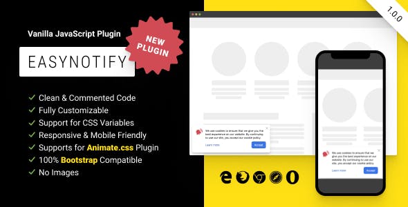
EasyNotify is a lightweight responsive JS plugin that allows you to create simple notification in modern, flat style with several options.
Create and show notifications with information that you want to convey. Customize and style notifications to fit your needs.
Great for displaying news, messages on your site or providing feedback for the user.
Features
- Easy Integration With Any Website
- Clean & Commented Code
- Fully Customizable
- Support for CSS Variables
- Responsive & Mobile Friendly
- Support for Animate.css Plugin
- Create any Notification Text
- Show or Hide Any Elements
- Custom Icons
- Different Positions
- Unlimited Notifications Sets
- 100% Bootstrap Compatible
- No Images
- No jQuery Dependency
- Cross-Browser Compatibility
- Free Updated
Installation
<!doctype html>

<html>
  <head>
    <!-- 0. Optional: add Animate.css plugin -->
    <link href="https://cdnjs.cloudflare.com/ajax/libs/animate.css/4.1.1/animate.min.css" rel="stylesheet">
    <!-- 1. Paste the stylesheet into the <head> of your web page -->
    <link href="easy-notify.min.css" rel="stylesheet">
  </head>

  <body>
    <h1>Hello, EasyNotify!</h1>

    <!-- 2. Add the javascript file near the end of your pages, right before the closing </body> tag -->
    <script src="easy-notify.min.js"></script>
    <!-- 3. Init EasyNotify with or without options -->
    <script>
      easyNotify();
    </script>
  </body>
</html>
Customization
All options are optional.
easyNotify({
  // {String}: unique identifier of the box for saving in local storage
  // e.g. 'newYear2021', 'hello', 'gFbb3A', etc.
  id: '',

  // {String}: the theme of the box
  // must be '' or 'dark'
  theme: '',

  // {Boolean}: when developer mode is enabled, closing the box is not saved in local storage
  // must be true or false
  dev: false,

  // {String}: the background color of the box
  // css-variable analog: --easy-notify-bg-color
  // e.g. '#f3f0d6', '#d6f3de', 'white', etc.
  bgColor: '#ffffff',

  // {String}: the background image of the box
  // css-variable analog: --easy-notify-bg-image
  // e.g. 'url("path_to_image.jpg")', 'linear-gradient(to right, #d6e9f3, #f2e1fd)', etc.
  bgImage: 'none',

  // {String}: the font color of the box
  // css-variable analog: --easy-notify-color
  // e.g. 'currentColor', '#2f6e92', 'black', etc.
  color: '#222222',

  // {String}: the width of the box
  // css-variable analog: --easy-notify-width
  // e.g. '320px', '640px', etc.
  width: '450px',

  // {String}: the padding of the box
  // css-variable analog: --easy-notify-padding
  // e.g. '32px', '16px 24px', '24px 32px 16px 16px', etc.
  padding: '24px',

  // {String}: the border radius of the box
  // css-variable analog: --easy-notify-radius
  // e.g. '0', '4px 16px 4px 16px', etc.
  radius: '8px',

  // {String}: the shadow of the box
  // css-variable analog: --easy-notify-shadow
  // e.g. 'none', '0 8px 16px rgba(0, 0, 0, 0.25)', '4px 4px 32px rgba(255, 0, 0, 0.5)', etc.
  shadow: '0 -1px 1px rgba(0, 0, 0, 0.05), 0 2px 2px rgba(0, 0, 0, 0.05), 0 4px 4px rgba(0, 0, 0, 0.05), 0 8px 8px rgba(0, 0, 0, 0.05), 0 16px 16px rgba(0, 0, 0, 0.05), 0 32px 32px rgba(0, 0, 0, 0.05)',

  // {Number}: the z-index of the box
  // e.g. 10, 120, 100100100, etc.
  zIndex: 100000,

  // {String}: the position of the box
  // must be 'top-left', 'top-right', 'bottom-right' or 'bottom-left'
  position: 'bottom-left',

  // {String}: the name of the animation when it appears
  // css-variable analog: --easy-notify-animation-name-in
  // must be custom animation name or animation name from animate.css plugin
  animationNameIn: 'easyNotifyIn',

  // {String}: the name of the animation when it disappears
  // css-variable analog: --easy-notify-animation-name-out
  // must be custom animation name or animation name from animate.css plugin
  animationNameOut: 'easyNotifyOut',

  // {String}: the duration time of the animation in seconds
  // css-variable analog: --easy-notify-animation-duration
  // e.g. '0s', '1.5s', etc.
  animationDuration: '0.5s',

  // {String}: the box appears after the specified time in seconds
  // css-variable analog: --easy-notify-animation-delay
  // e.g. '1s', '3.5s', etc.
  animationDelay: '0s',

  // {Boolean}: hide the close button
  // must be true or false
  closeBtnHide: false,

  // {String}: the color of the close button
  // css-variable analog: --easy-notify-close-color
  // e.g. 'currentColor', '#2f6e92', 'black', etc.
  closeBtnColor: '#acacad',

  // {String}: the hover color of the close button
  // css-variable analog: --easy-notify-close-color-hover
  // e.g. 'currentColor', '#2f6e92', 'black', etc.
  closeBtnColorHover: '#858687',

  // {Boolean}: hide the icon
  // must be true or false
  iconHide: false,

  // {String}: the color of the default icon
  // css-variable analog: --easy-notify-icon-color
  // e.g. 'currentColor', '#2f6e92', 'black', etc.
  iconColor: '#f5234b',

  // {String}: the src attribute of the custom icon
  // must be '' or 'path_to_image.png'
  iconSrc: '',

  // {Number}: the size of the custom icon by width
  // e.g. 24, 36, etc.
  iconWidth: 48,

  // {Number}: the size of the custom icon by height
  // e.g. 24, 36, etc.
  iconHeight: 48,

  // {String} the description of the box
  // e.g. 'Orders placed online from November 24th until December 21st 2020 can be returned up until February 1st 2021 for a full refund.', 'Discover our gifts — to share with those closest to you, or simply to keep for yourself.', etc.
  content: 'We use cookies to ensure that we give you the best experience on our website. By continuing to use our site, you accept our cookie policy.',

  // {Boolean}: hide the 'Learn more' link
  // must be true or false
  moreLinkHide: false,

  // {String}: the href attribute of the 'Learn more' link
  // e.g. '/privacy', '/gifts', etc.
  moreLinkHref: '#',

  // {String}: the text of the 'Learn more' link
  // e.g. 'About', 'Details', etc.
  moreLinkText: 'Learn more',

  // {String}: the font color of the 'Learn more' link
  // css-variable analog: --easy-notify-link-color
  // e.g. 'currentColor', '#2f6e92', 'black', etc.
  moreLinkColor: '#0066cc',

  // {String}: the hover font color of the 'Learn more' link
  // css-variable analog: --easy-notify-link-color-hover
  // e.g. 'currentColor', '#2f6e92', 'black', etc.
  moreLinkColorHover: '#0052a3',

  // {Boolean}: hide the accept button
  // must be true or false
  acceptBtnHide: false,

  // {String}: the text of the accept button
  // e.g. 'Close', 'Let’s Go', etc.
  acceptBtnText: 'Accept',

  // {String}: the background color of the accept button
  // css-variable analog: --easy-notify-btn-bg-color
  // e.g. 'currentColor', '#2f6e92', 'black', etc.
  acceptBtnBgColor: '#0070f5',

  // {String}: the font color of the accept button
  // css-variable analog: --easy-notify-btn-color
  // e.g. 'currentColor', '#2f6e92', 'black', etc.
  acceptBtnColor: '#ffffff',

  // {String}: the hover background color of the accept button
  // css-variable analog: --easy-notify-btn-bg-color-hover
  // e.g. 'currentColor', '#2f6e92', 'black', etc.
  acceptBtnBgColorHover: '#005ac4',

  // {String}: the hover font color of the accept button
  // css-variable analog: --easy-notify-btn-color-hover
  // e.g. 'currentColor', '#2f6e92', 'black', etc.
  acceptBtnColorHover: '#ffffff',

  // {String}: the padding of the accept button
  // css-variable analog: --easy-notify-btn-padding
  // e.g. '12px', '4px 20px', '4px 16px 4px 20px', etc.
  acceptBtnPadding: '0 16px',

  // {String}: the height of the accept button
  // css-variable analog: --easy-notify-btn-height
  // e.g. '30px', '50px', etc.
  acceptBtnHeight: '40px',

  // {String}: the border radius of the accept button
  // css-variable analog: --easy-notify-btn-radius
  // e.g. '0', '4px 8px 4px 8px', etc.
  acceptBtnRadius: '8px',
});
Browsers support
Plugin is compatible with all major browsers:
- Edge
- Firefox
- Chrome
- Safari
- Opera
Change log
v1.0.0
- Initial release